Logo
Logo
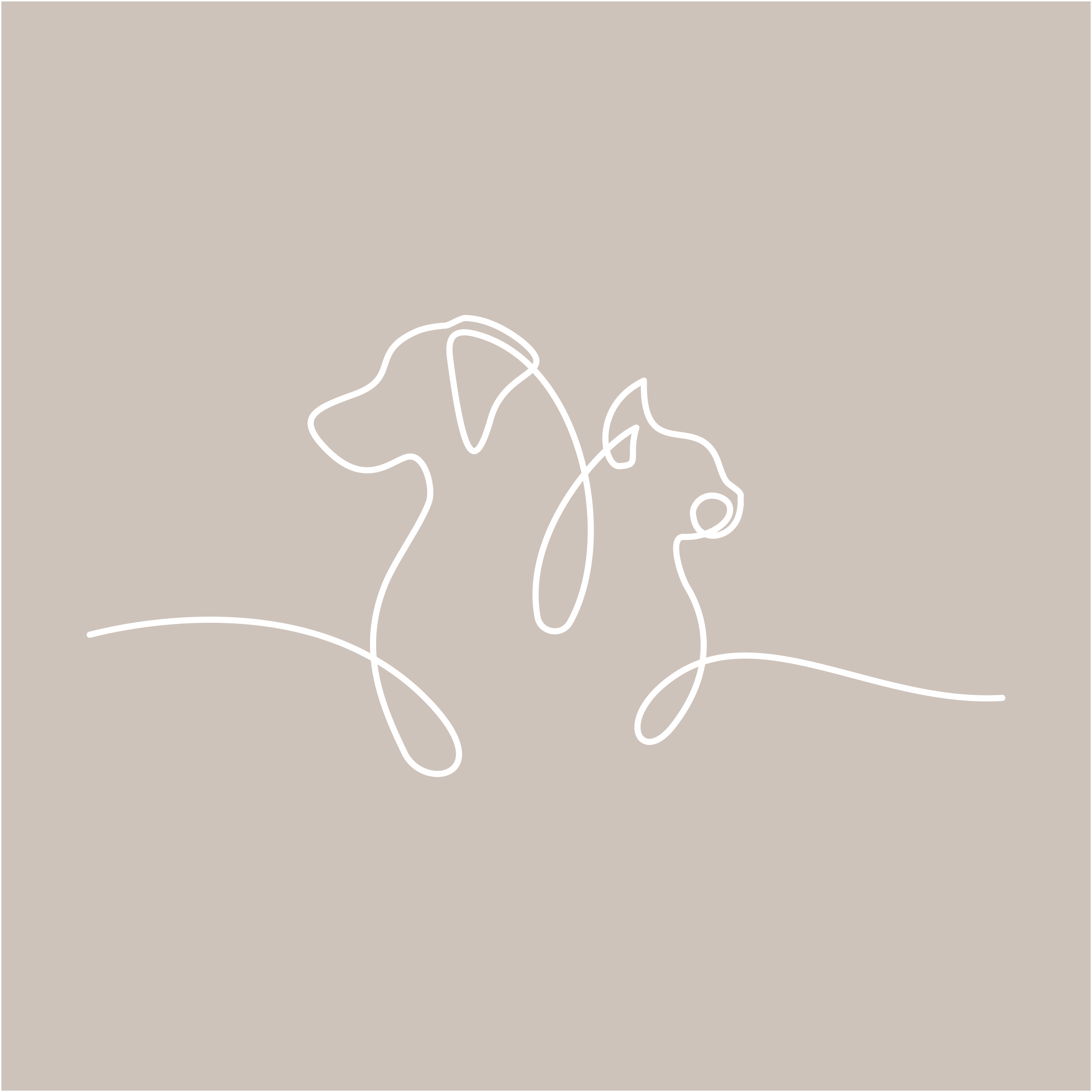
The rebranded Nooie logo features outlines of a cat and dog, symbolizing the brand's dedication to providing innovative pet care solutions. The oval shape with curved edges represents one of Nooie's flagship product, the Nooie Cam. The brandmark's rounded forms evoke a sense of warmth and approachability, aligning with the company's "Warm Tech" philosophy.The updated logotype is kerned and less bold, lending a more confident and impactful presence. The new branding embraces a more illustrative and descriptive approach, clearly communicating Nooie's focus on pet-centric products and services.

Iterations


Clear Space
Improves legibility and readability. Showcases proper use of clear space around brandmark, wordmark, and logo, and other elements. Makes it easier to read and comprehend by reducing visual clutter and allowing the eye to focus on the important information.


Does & Dont's
Used Nooie’s existing color palette as a strategic decision rooted in brand recognition and consistency. Maintained the essence of Nooie by signaling evolution and growth to audience. This continuity fosters trust while allowing for refreshed visual communication.


Colors
Altered Nooie’s existing color palette as a strategic decision rooted in brand recognition and consistency. Maintained the essence of Nooie by signaling evolution and growth to audience. This continuity fosters trust while allowing for refreshed visual communication.
Tan
#CEC3BA
Off White
#F3F0ED
White
#FFFFFF
Secondary 1
#000000
Typography


Assets


Icons


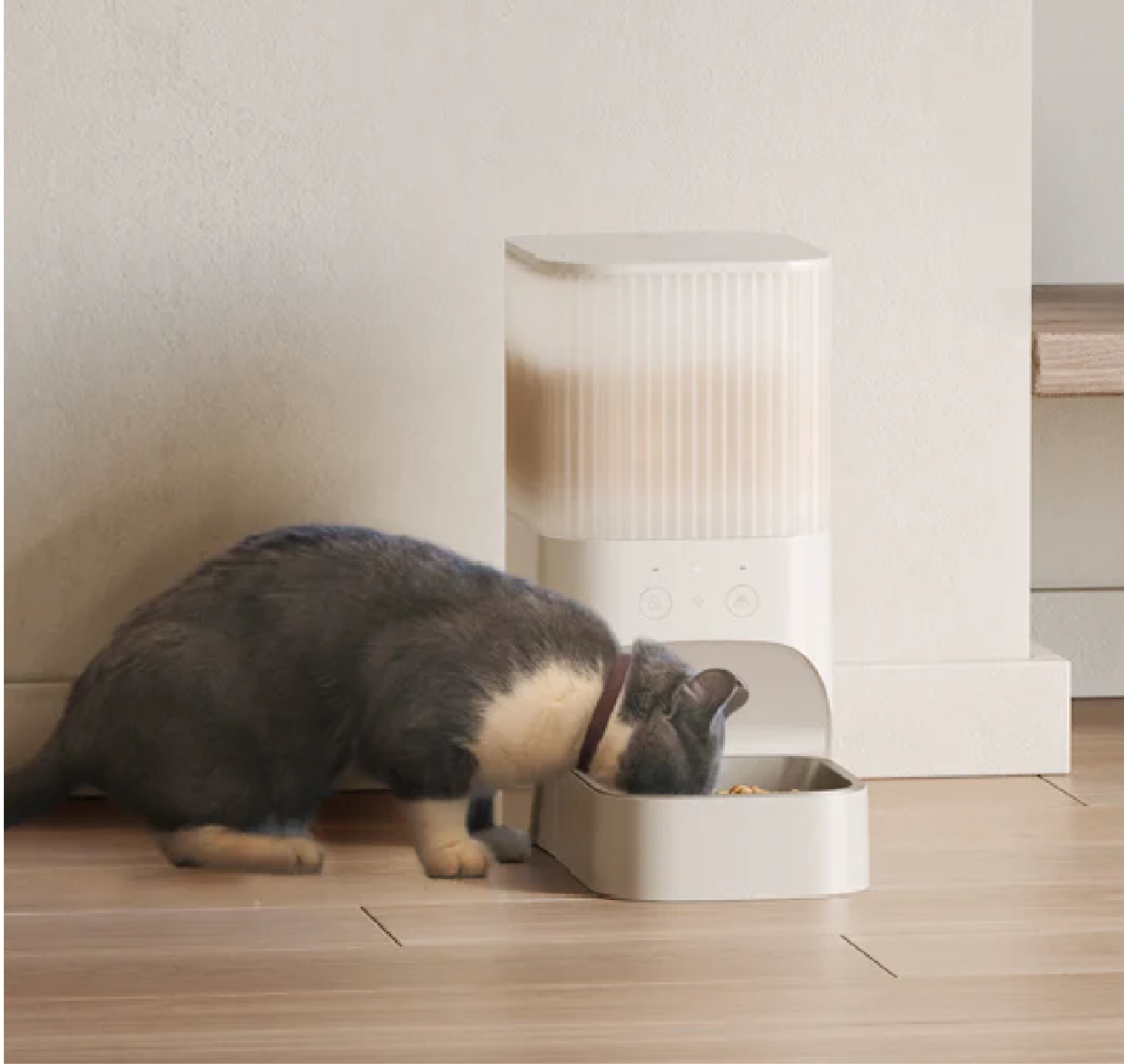
Photography